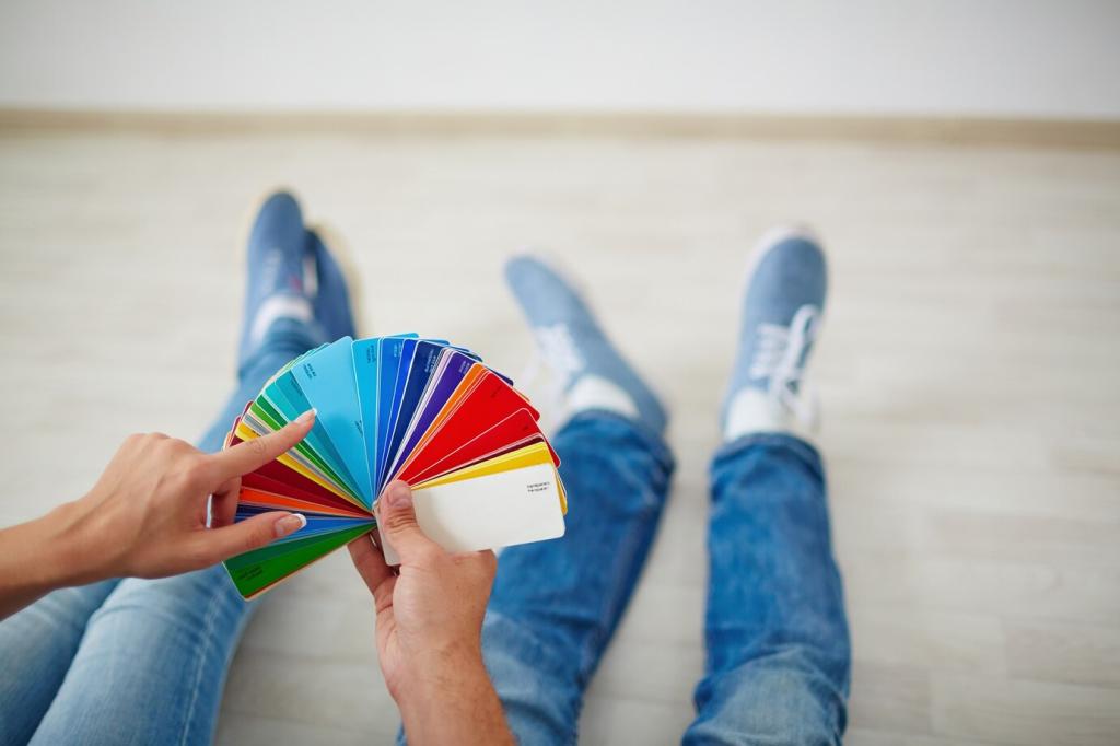

Entrance and Hallway: First Impressions in Hue
Creamy beige with a squeeze of apricot or soft coral says cheerful without shouting. It brightens quick hellos, flatters skin tones in mirrors, and introduces warmth before guests even untie their scarves.
Entrance and Hallway: First Impressions in Hue
Hallways are often light-starved. Warmer bulbs offset cool shadows; semi-gloss paint bounces scarce light pleasantly. If a hallway faces north, choose warm undertones to counter the natural blue cast and keep it inviting.