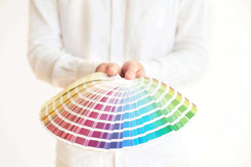

Build a Palette That Loves Your Furniture
Choose one star item—perhaps a deep green velvet sofa or a vintage rug. Sample wall colors that heighten its beauty, then repeat that hue softly through pillows, throws, and ceramic accents.
Build a Palette That Loves Your Furniture
Anchor your room with one dominant wall color, one supporting furniture tone, and one accent hue. Add flexible neutrals—black, white, or wood—to balance saturation and keep the palette feeling intentional, never busy.